Swiggy App: Heuristic Evaluation
Heuristic evaluation (Nielsen and Molich, 1990; Nielsen 1994) is a usability engineering method for finding the usability problems in a user interface design so that they can be attended to as part of an iterative design process.

1. Consistency and Standard

As you can see, Swiggy uses fairly simple icons that can be found in many other apps that are similar to it. Even though Swiggy has a fantastic design team, they continue to use the standard iconography.
These icons are quite familiar and simple to understand. There is no need for users to relearn these icons again.
2. Recognition rather than recall

When you search food in Swiggy you can see your recent search history, there is a reason behind this.
The recent searches help us quickly see what we recently looked for instead of having to remember what it was.
3. User Control and Freedom

Before you proceed to pay for your food have you ever wondered why there is a + and - buttons for changing the quantity?
The + and - buttons make it simple to rapidly change our order without having to return to the previous screen and go through the same steps again.
4. Visibility of System Status

When we place an order with Swiggy, we can see a nice illustration of the order progress. Why are they illustrating the procedure or displaying everything that takes on between the time you place your purchase and the time it arrives at your door?
The order status helps us know at what stage our order is, keeping us informed about what’s going on.
5. Help User Recognize, Diagnose, and Recover from Errors

Swiggy gives customers 60 seconds after placing a purchase to change their minds without incurring a cost for doing so. Know why?
Users might have placed a wrong order. The option to cancel helps them quickly undo that error.
6. Aesthetic and Minimalist Design
Have you ever thought about why food items have very few descriptions?
Too many details confuse us and we end up finding it hard to find the relevant information.
7. Flexibility and Efficiency of Use

Why do apps have a filter option? Have you ever thought of this?
Users can customize what they want to order and thus make decisions faster.
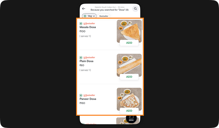
8. Match between System and Real World

When you look for food items in a particular restaurant Swiggy has an amazing UI that showcases the menu card. Why did they take this approach to design the menu card? Have you ever thought about it?
The menu list is like the menu card we commonly see at restaurants as well. Thus, helps the users to find the right food for them.
9. Error Prevention

Why have they shown unavailable menu items in grey and removed “add” button?
Grey is usually a color of inactivity & looks in contrast to colored and we hence know the menu item is unavailable and don’t try and order them. It also informs us about the next slot it will be available so that we can place the order then.
10. Help and Documentation

Why do they have a help and support tab?
In case we get lost or have other questions, the help and support tab gives us more information and solutions.
These are the 10 Heuristic Evaluation Principles

If you find this informative please do follow me on Medium 😊
